Agile Burndown Chart Generator
Published Mar 16, 2026
⦁
2 min read
Agile Burndown Chart Generator
Track Your Agile Sprints with Ease Using a Burndown Chart Tool
If you’re running Agile projects, staying on top of sprint progress is everything. A well-made burndown chart can be your best friend, offering a snapshot of how much work is left and whether your team’s pace matches the plan. Our free web-based solution lets you create these charts in seconds, turning raw data like story points and sprint days into a clear visual that anyone can understand.
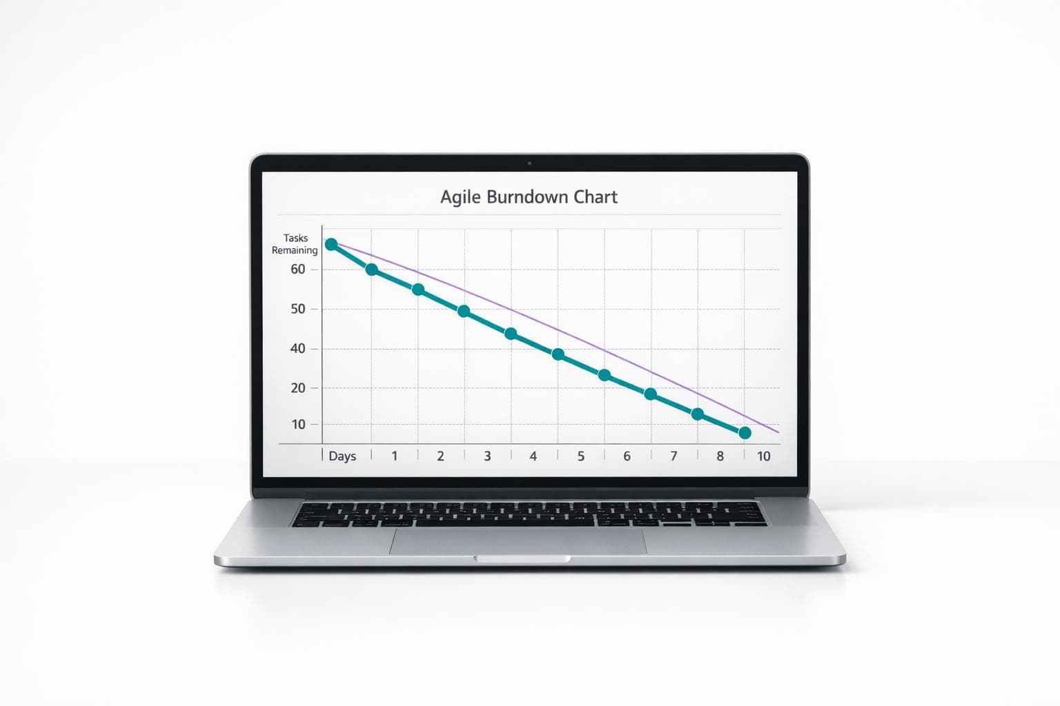
Why Visualization Matters in Agile Workflows
When you’re juggling tasks in a fast-paced sprint, it’s easy to lose sight of the big picture. That’s where a sprint progress tracker shines—it highlights trends, like if your team is consistently falling behind or crushing it early on. By inputting daily updates, you get a graph that compares your actual progress to the ideal line, plus a quick status check on your sprint’s health. No guesswork, just clarity. Whether you’re a seasoned project manager or just dipping your toes into Agile methodologies, this kind of insight helps you adjust on the fly and keep stakeholders in the loop. Give it a try and see how much smoother your sprints can run!
FAQs
What exactly is a burndown chart in Agile?
A burndown chart is a visual tool used in Agile to track a team’s progress during a sprint. It shows the amount of work—usually in story points—remaining over time. You’ve got an ideal line that slopes down to zero by the end of the sprint, and then your actual line, which updates based on daily progress. If the actual line is above the ideal, you’re behind; below it, you’re ahead. It’s a quick way to gauge if your team’s on track.
How often should I update the data in this tool?
Ideally, you’d update it daily, just like in a typical Agile workflow. Pop in the story points completed or remaining after each stand-up or end-of-day check-in. That keeps the chart accurate and gives you a real-time view of your sprint health. But hey, if your team’s rhythm is different, just update whenever you log progress—it’ll still work fine.
Can this tool help if my team is new to Agile?
Absolutely! This burndown chart generator is perfect for beginners because it simplifies a core Agile concept into an easy visual. You don’t need to be a scrum master to understand if your sprint’s going well—just look at the lines on the graph. Plus, the sprint health summary gives you a quick verdict, so new teams can focus on learning rather than crunching numbers. Start with basic inputs, and you’ll get the hang of tracking progress in no time.
Ready to improve your team's planning?
Put what you've learned into practice! Make your next planning session more engaging and accurate.
Try for free - no signup required